Year
2014 Aug
About Project
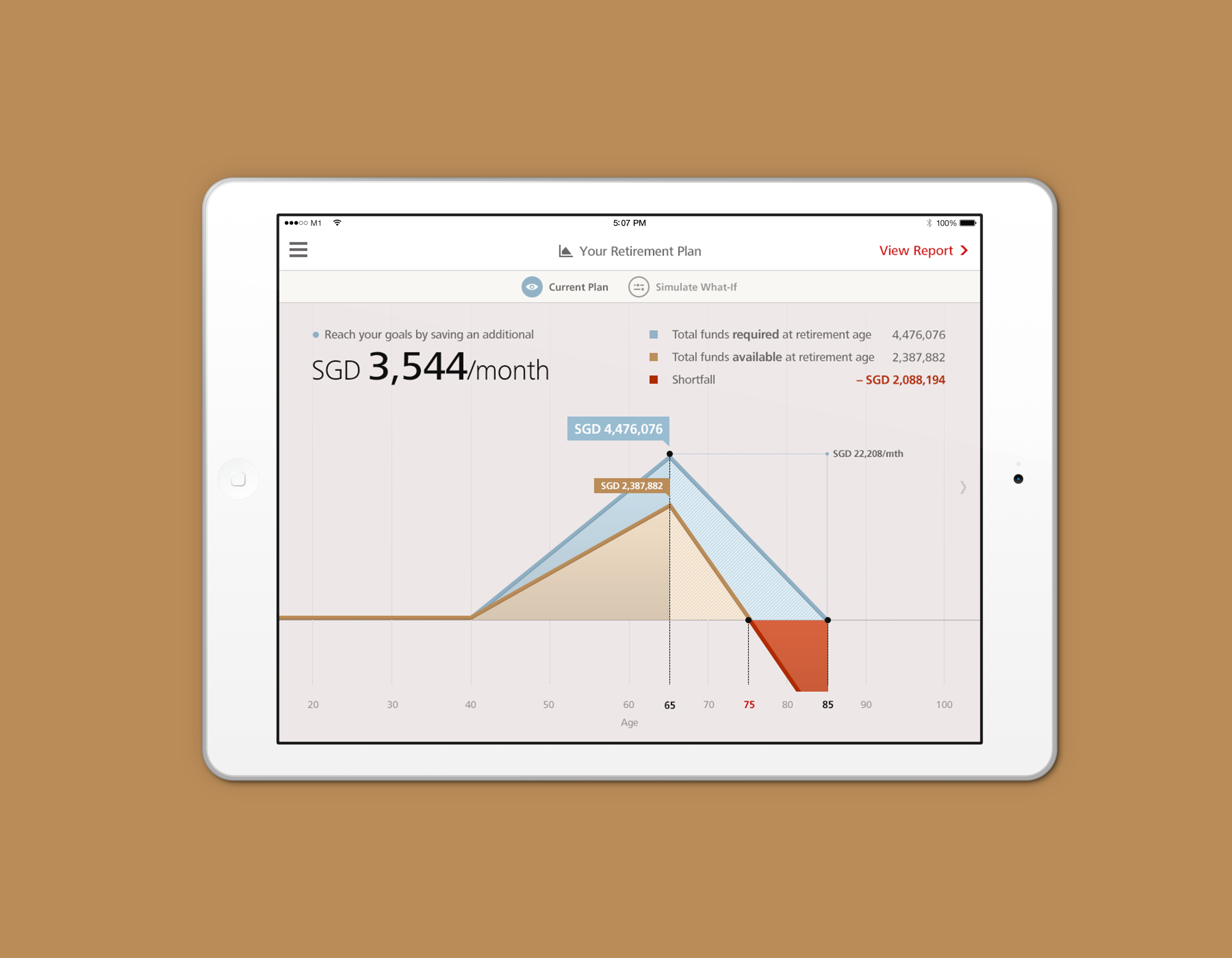
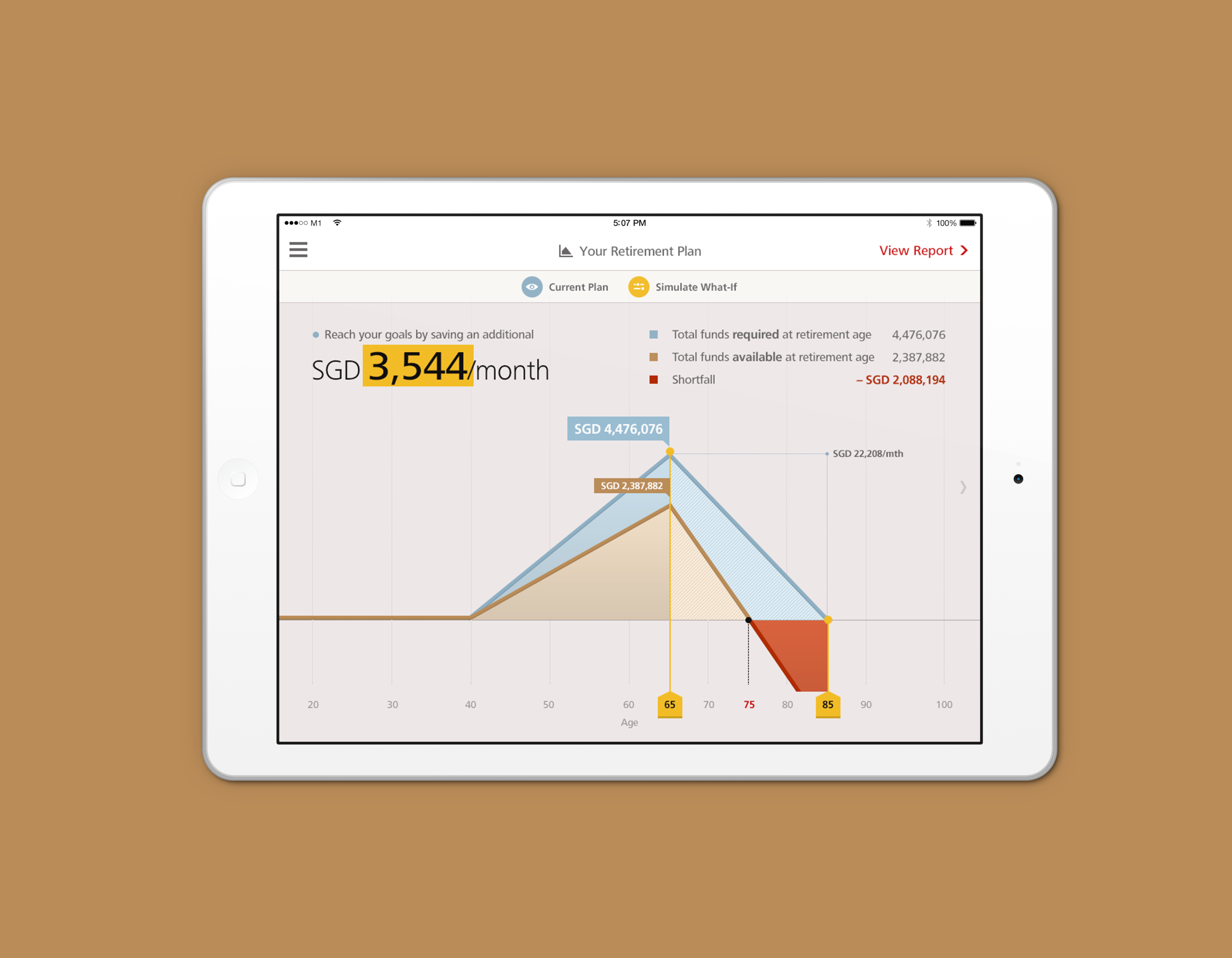
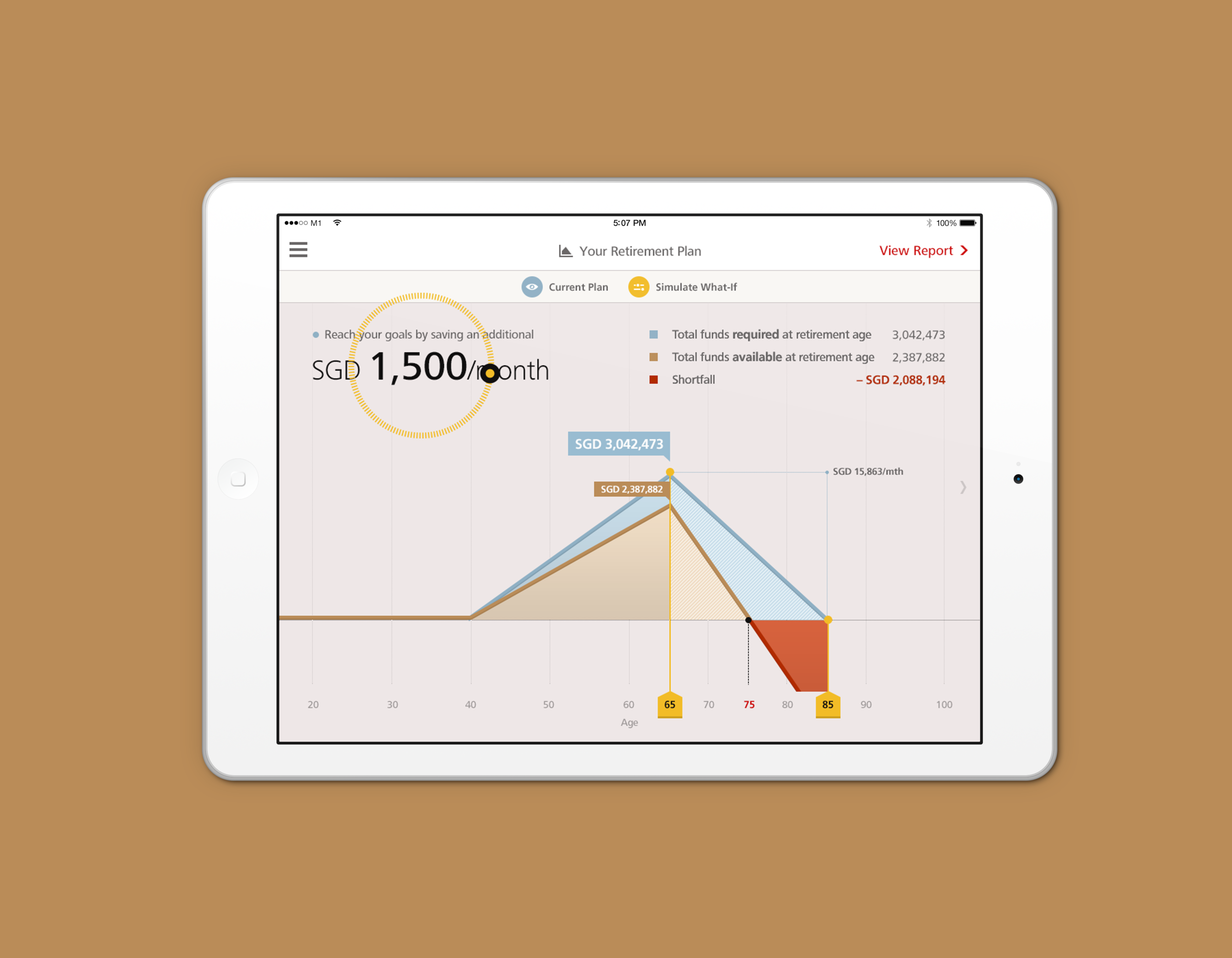
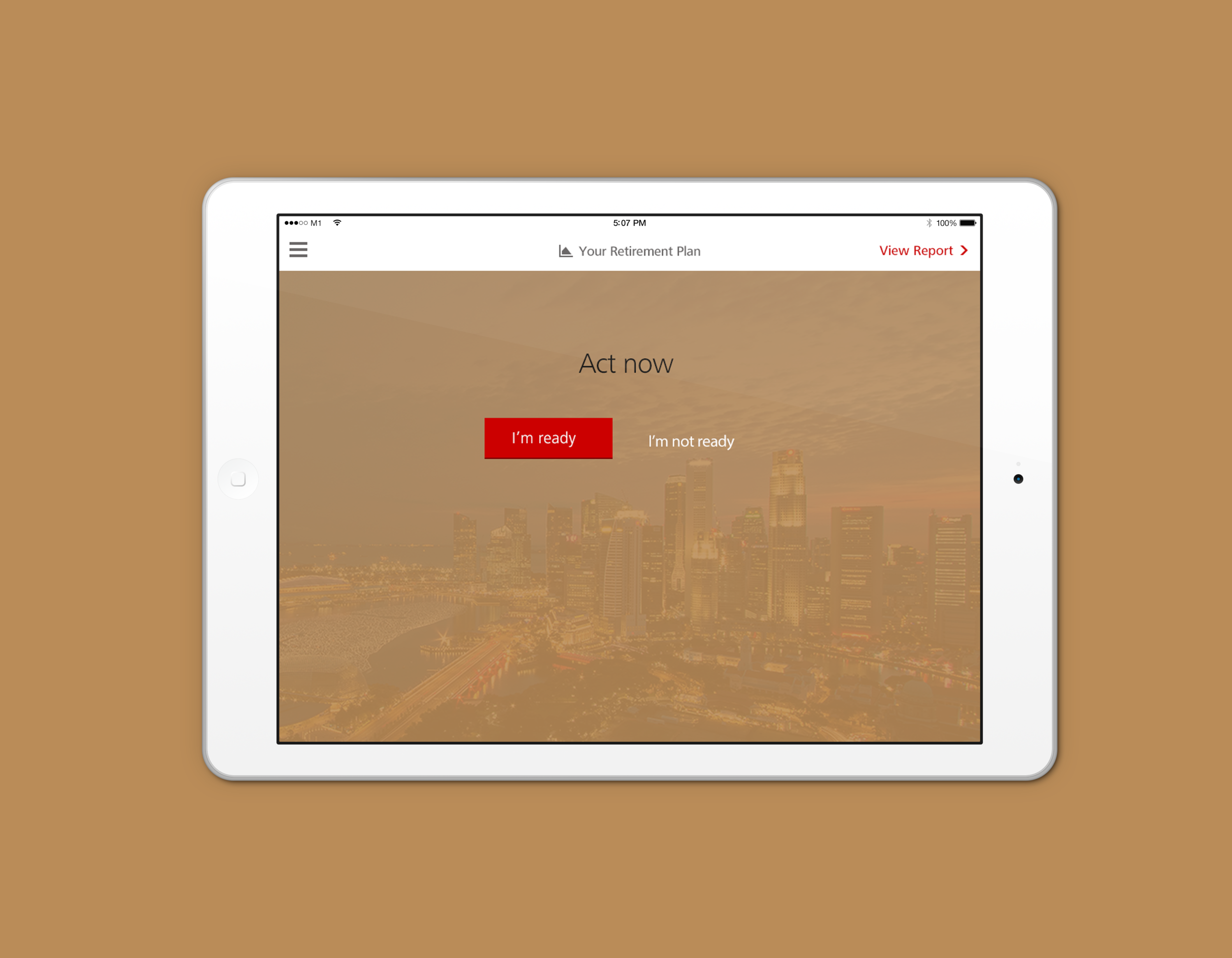
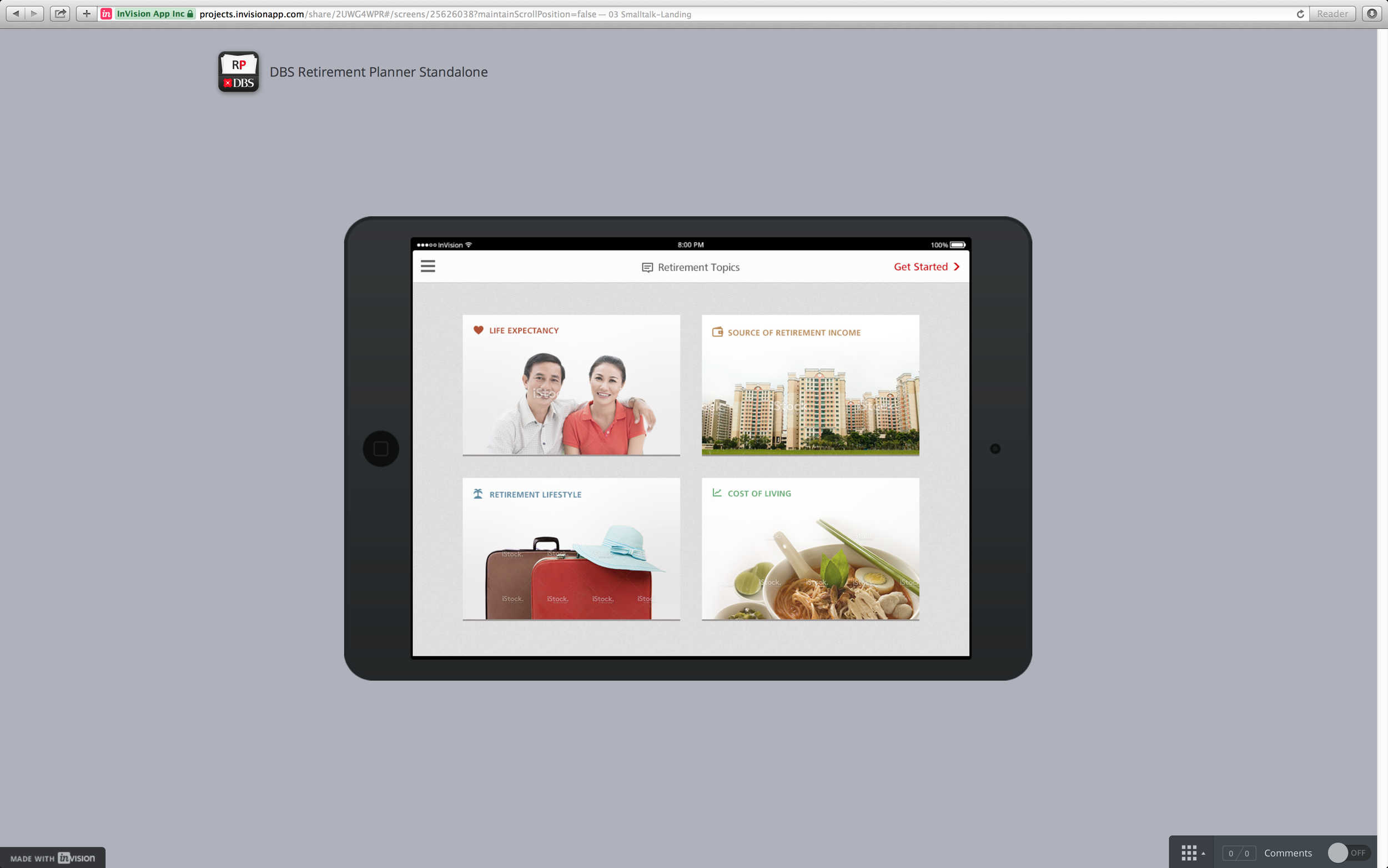
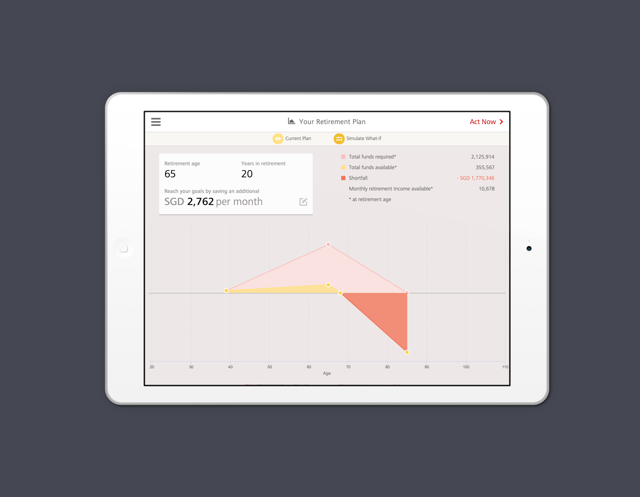
Retirement Planner iOS app is productivity tool that allow DBS Relationship Manager to illustrate the retirement facts/news, awareness of rising cost of living, and retirement income gap based on customer’s sources of income. We designed the app with x-discipline team—insurance team, marketing, product team, senior management (project’s sponsors) and our end users—the Relationship Manager—to ensure that we designed a product that improve their productivity and increase efficiency.
What I did
I worked closely with Poon Wen Ang, Designer from Aleph Lap; provided clear design direction and filtered the internal feedback and comments into actionable items. We developed lot of iterative wireframes, visual design style, UI Kit, icon font, and interactive prototypes.
THE DESIGN
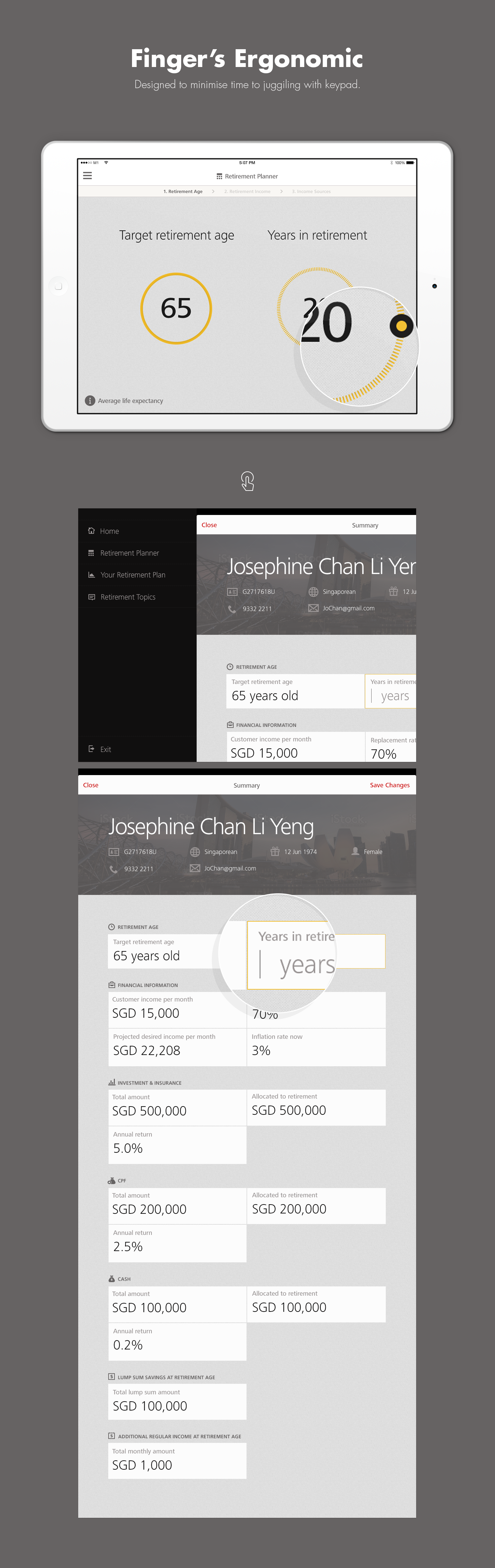
Full of thoughtful touches to make working flow simpler, more pleasant, and more productive.
Built for Conversations
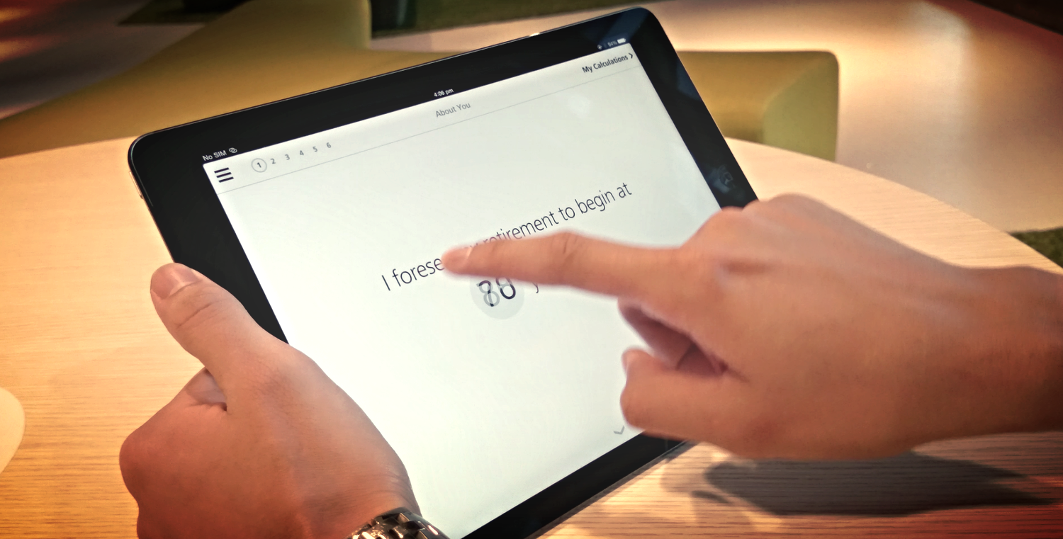
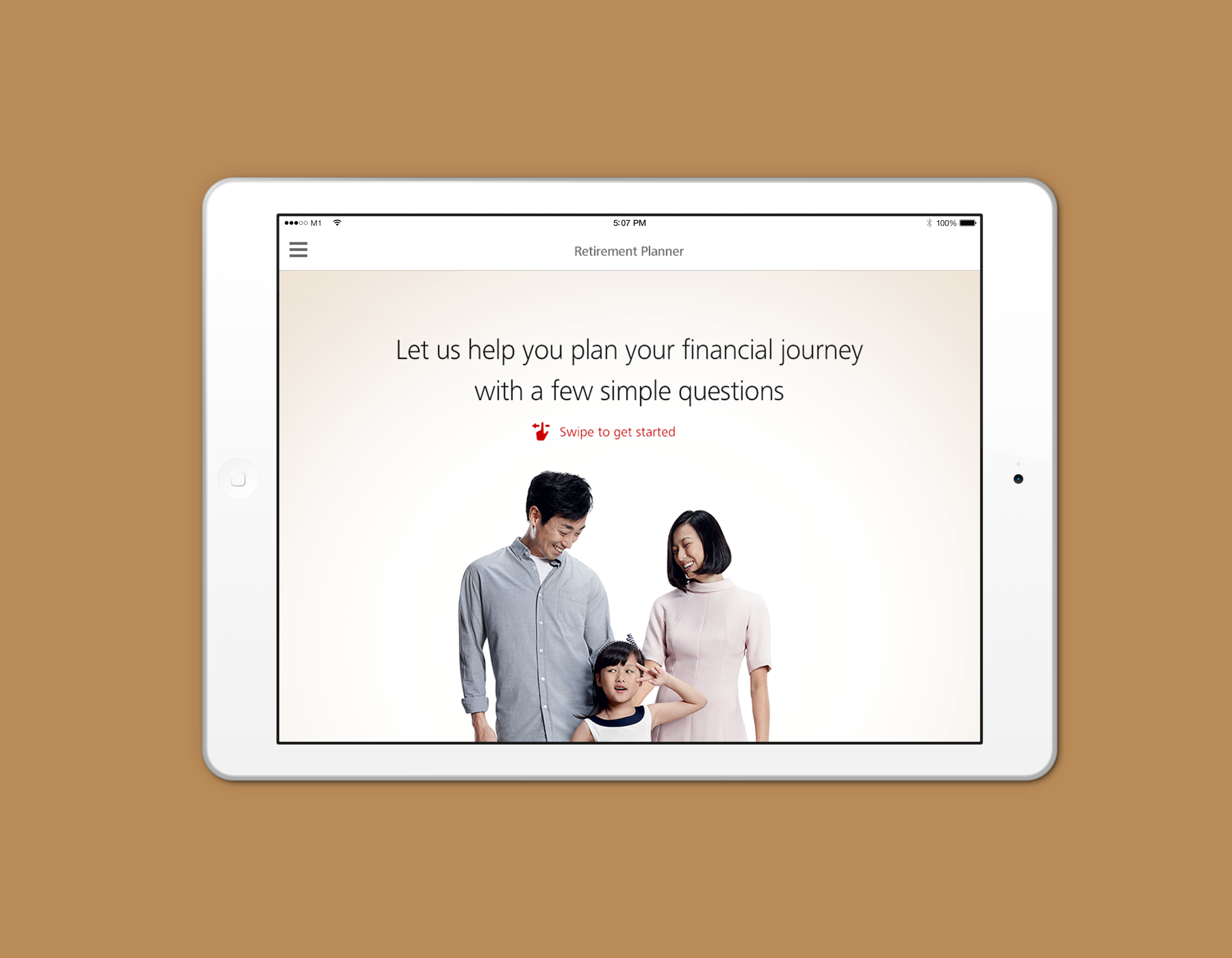
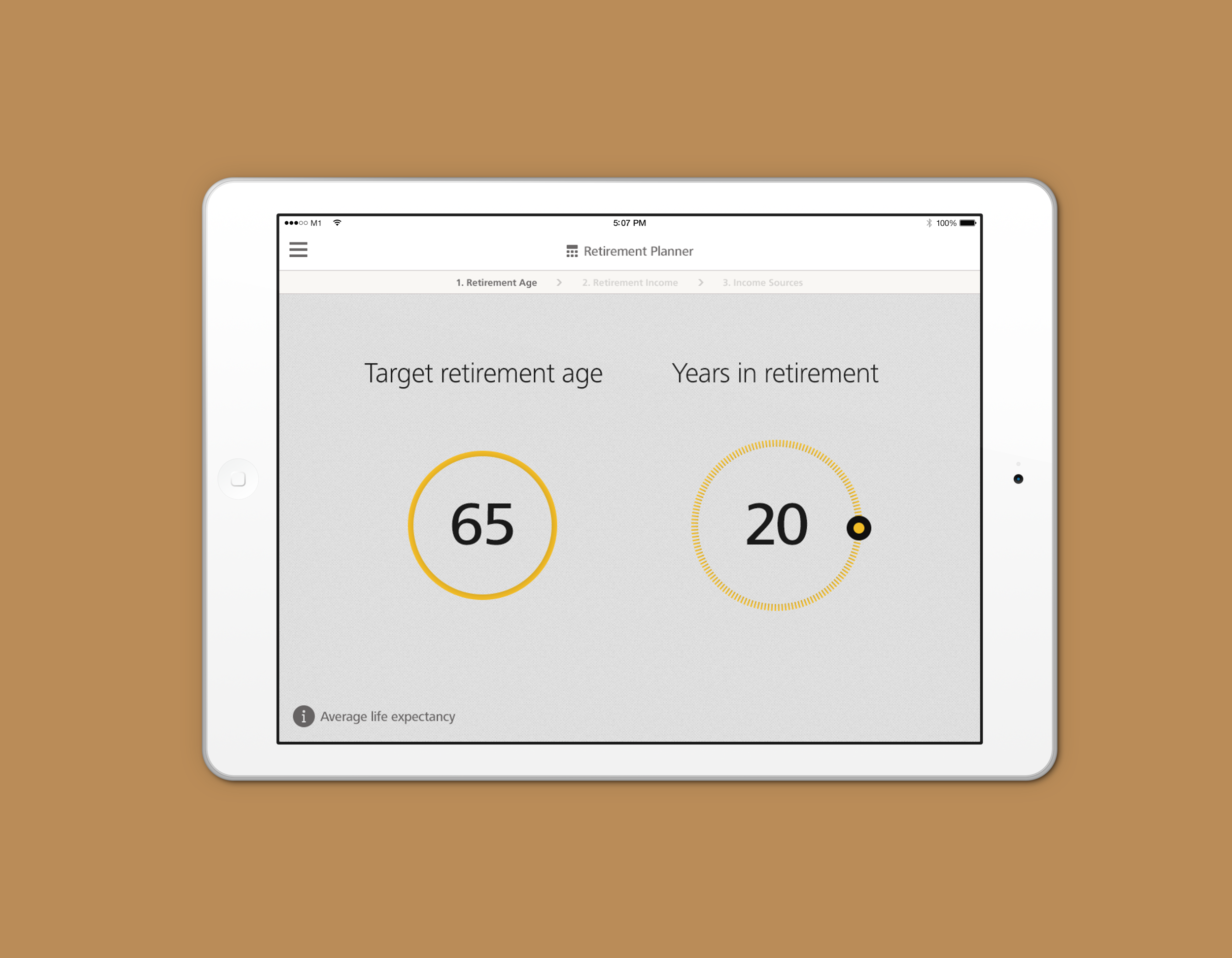
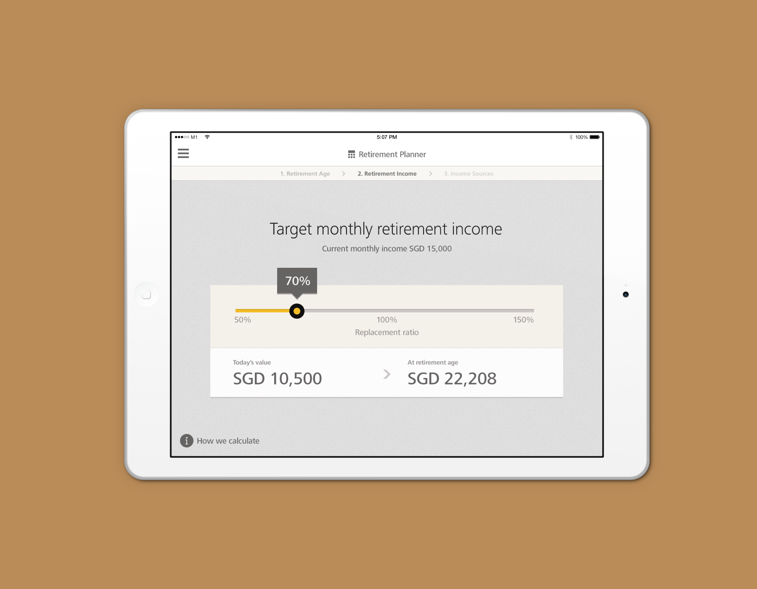
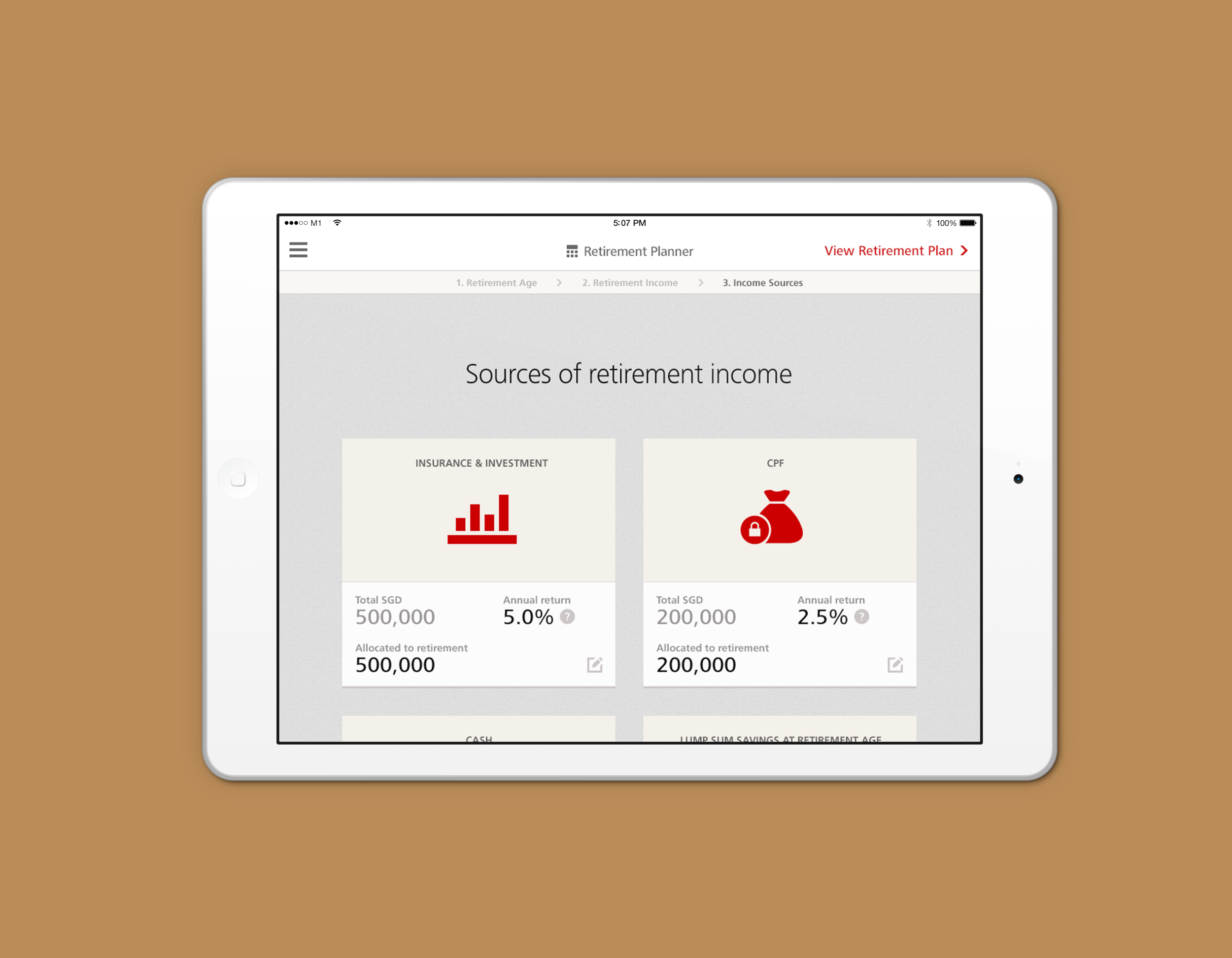
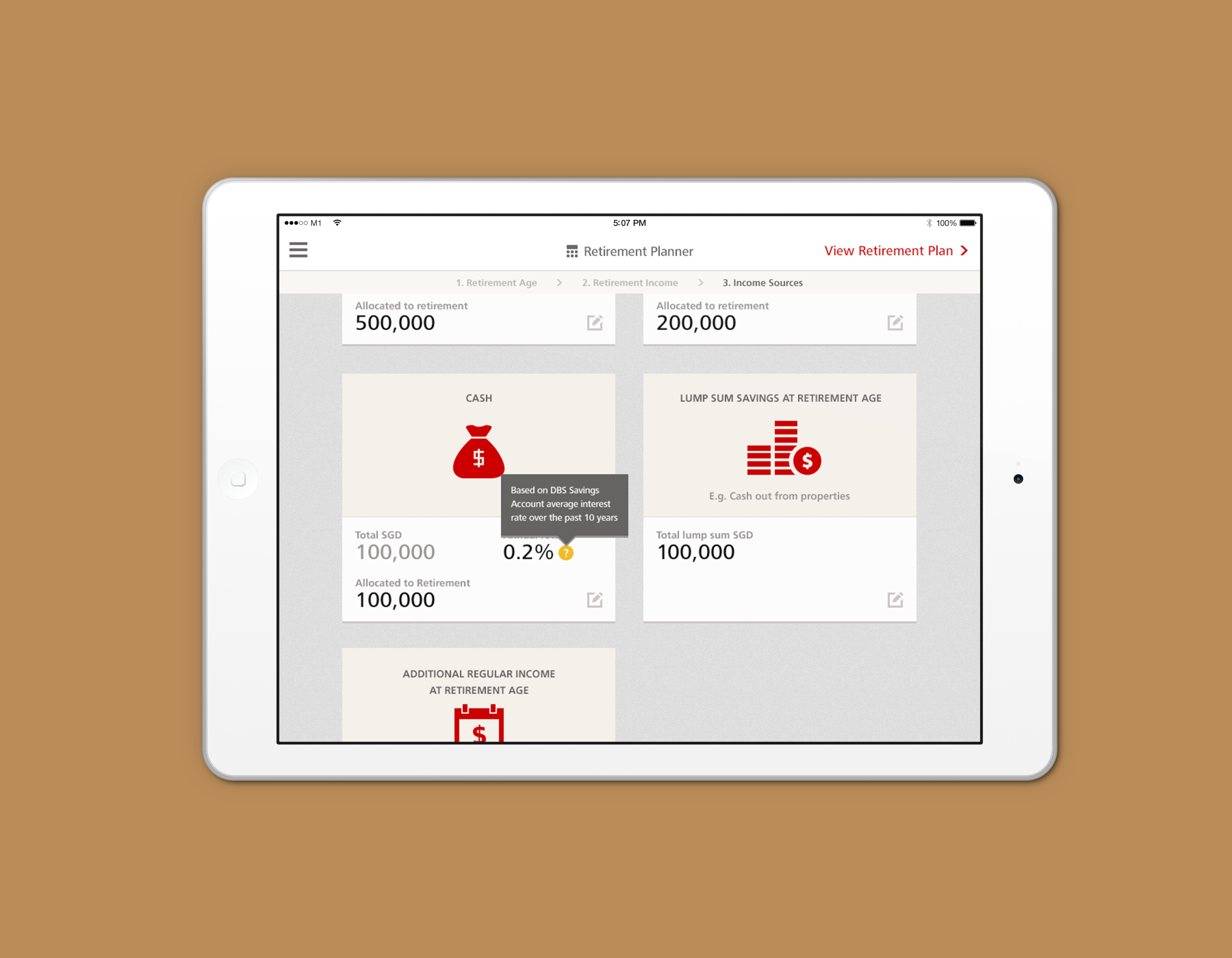
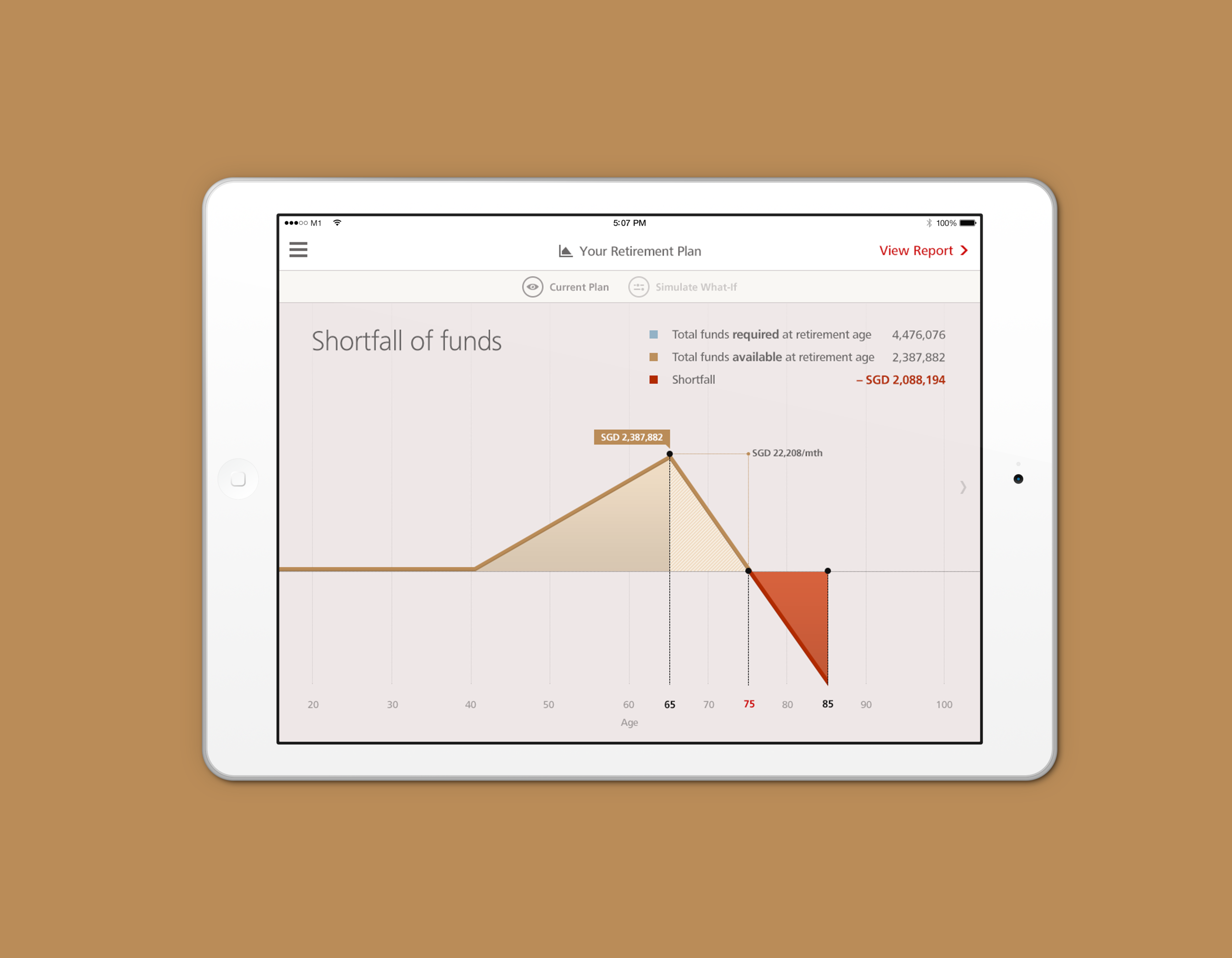
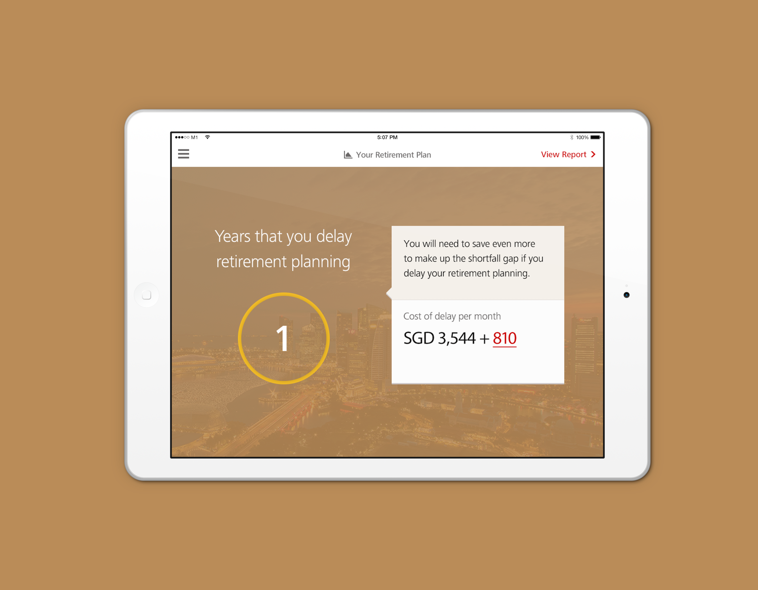
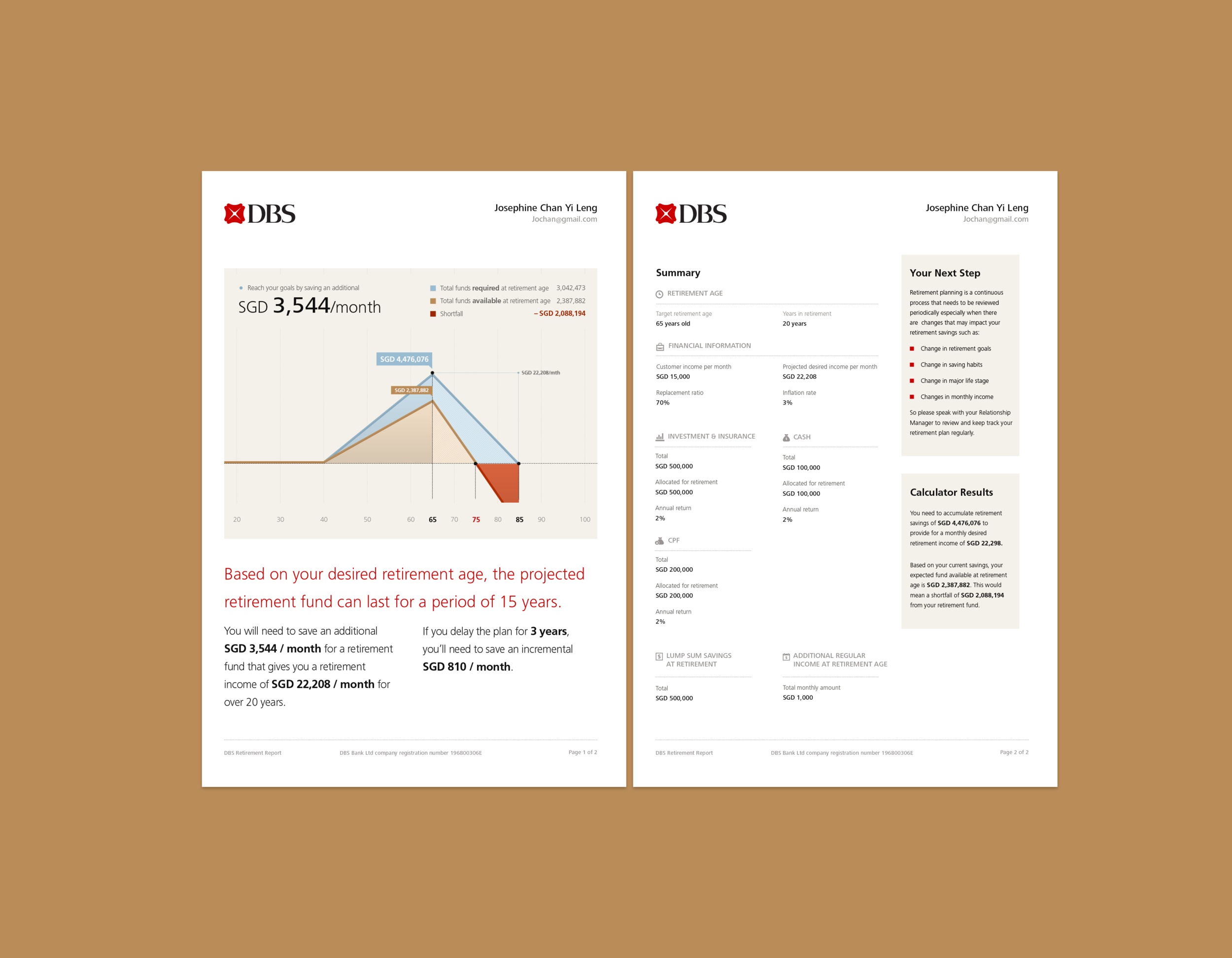
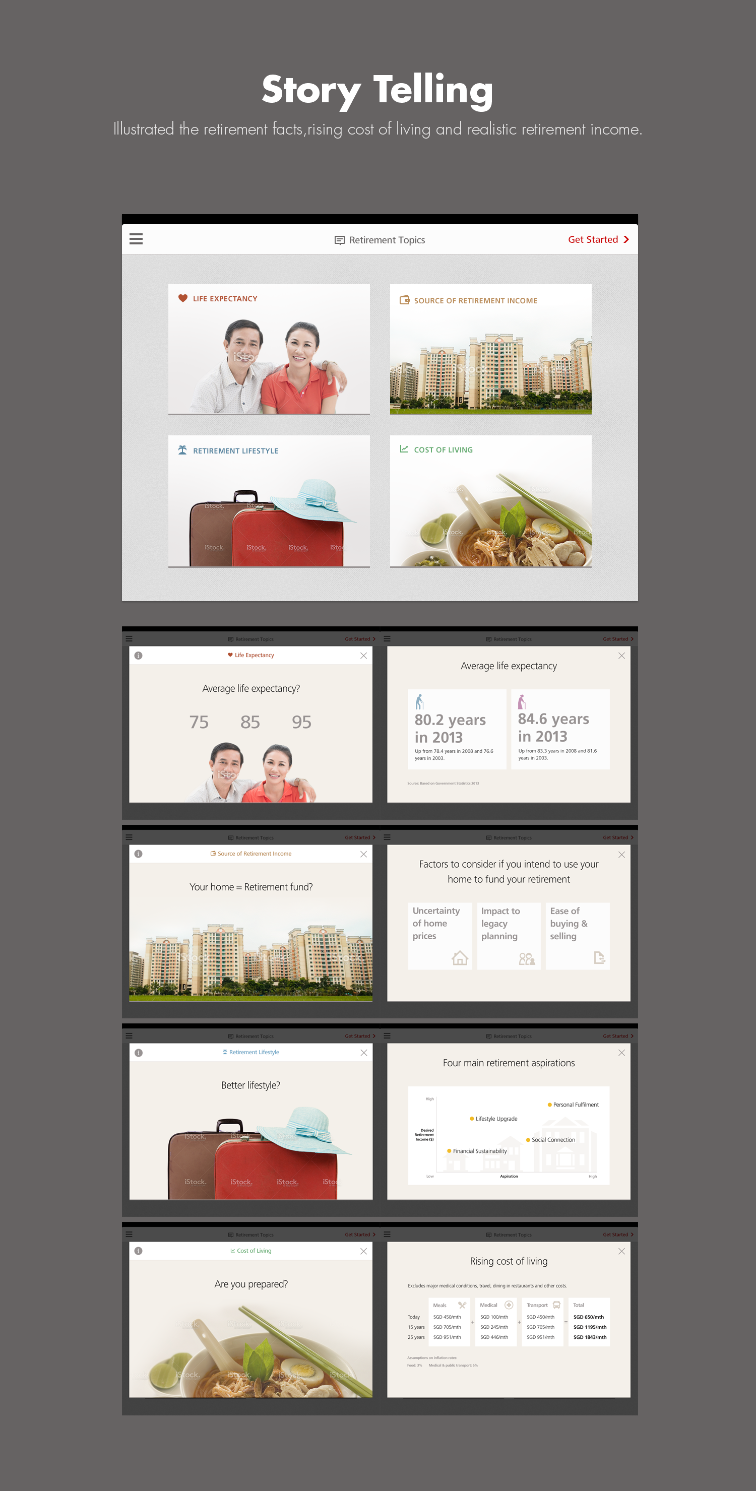
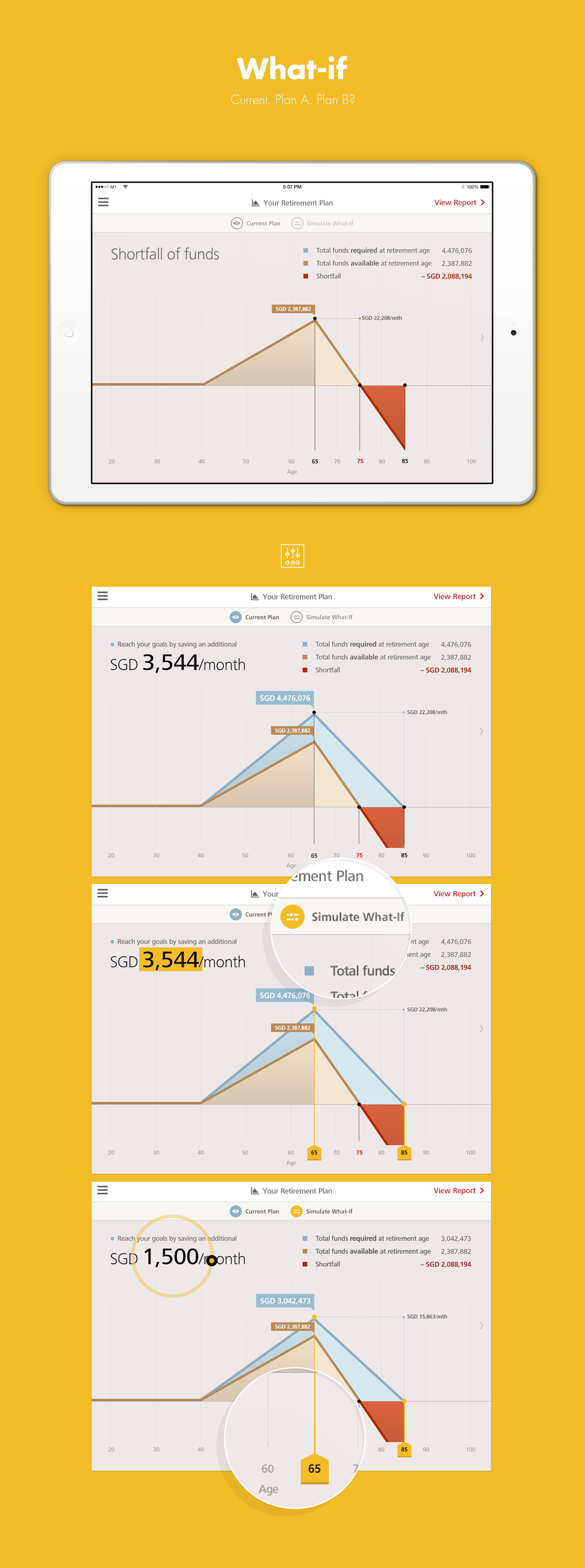
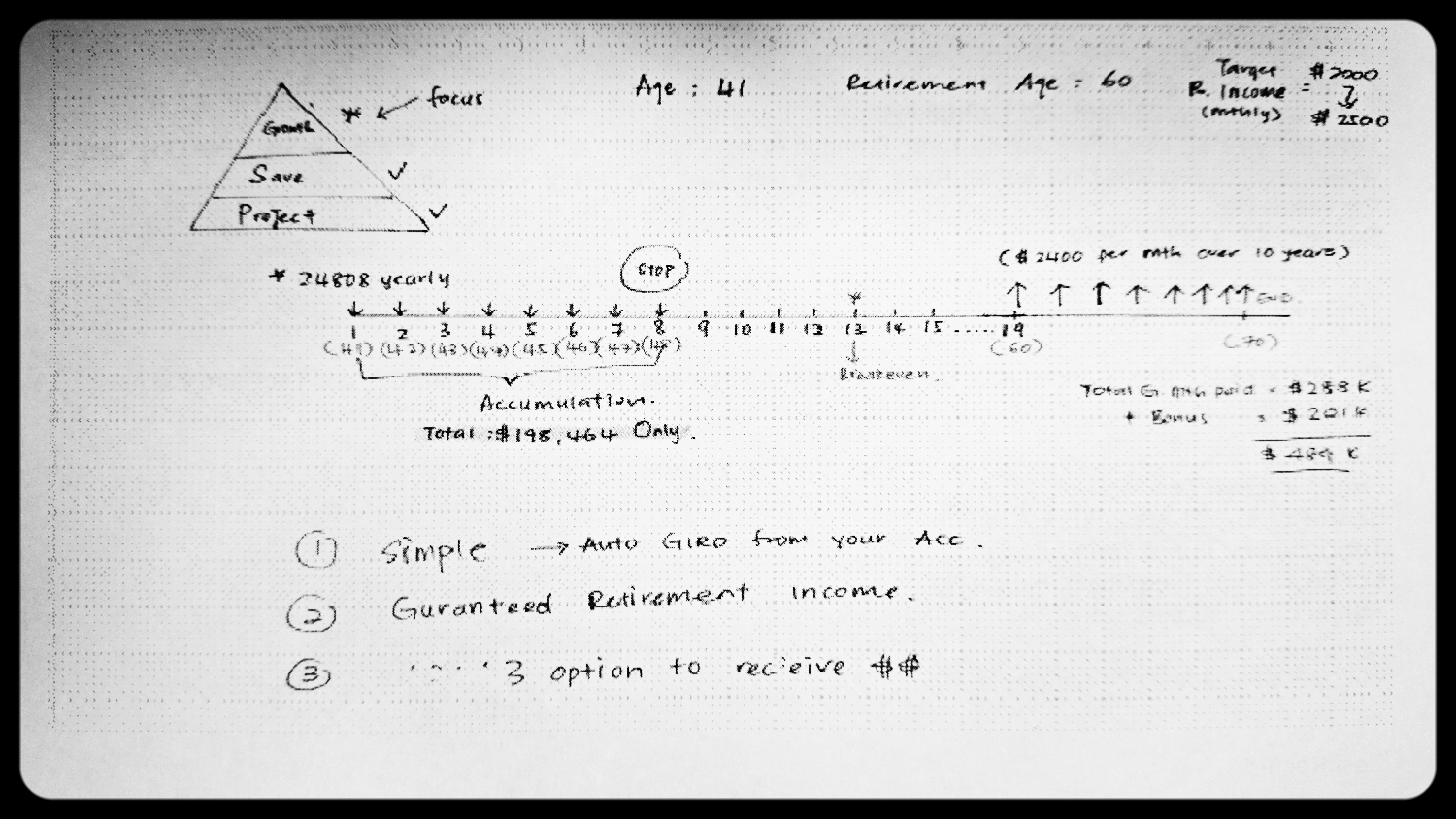
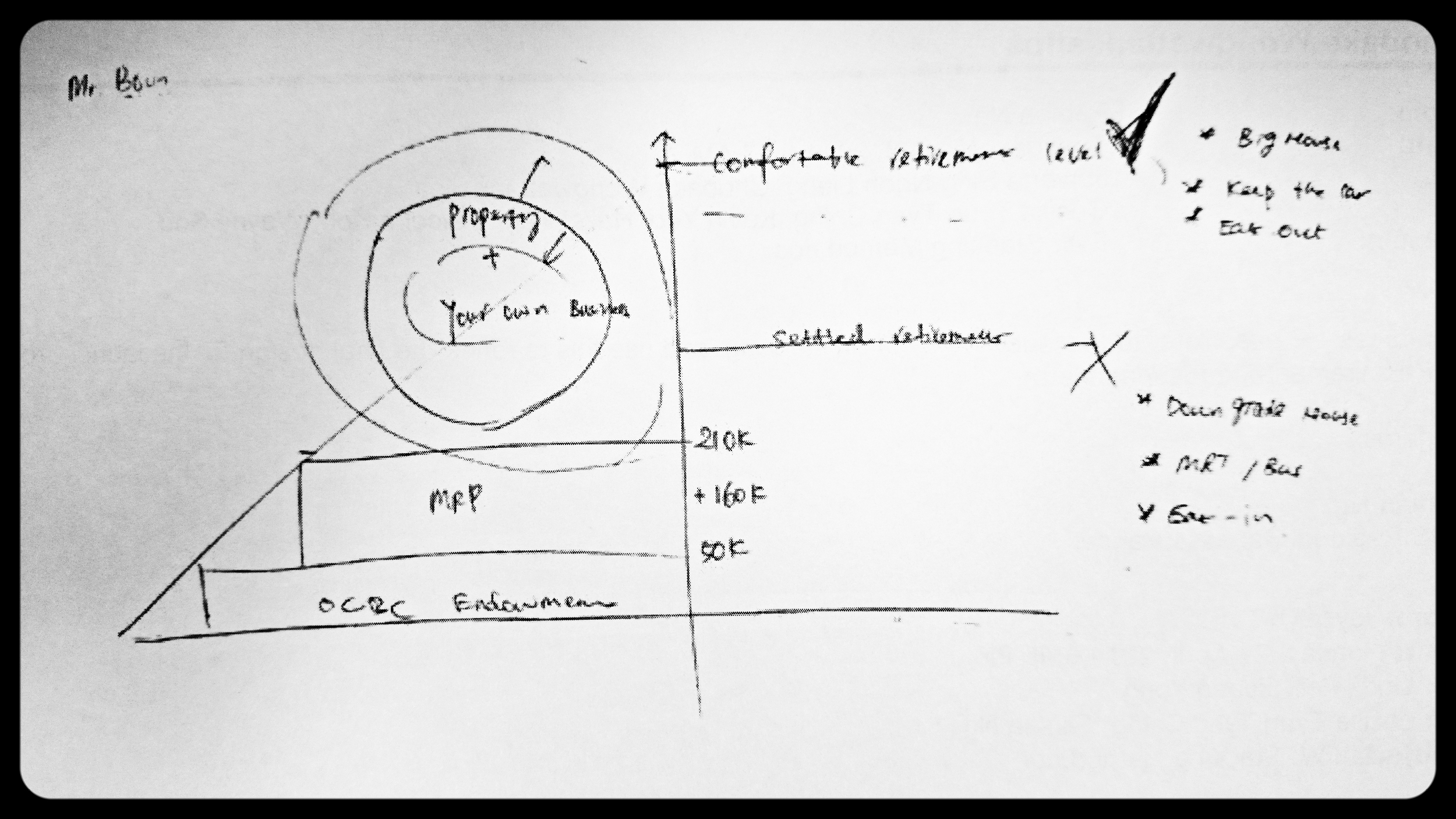
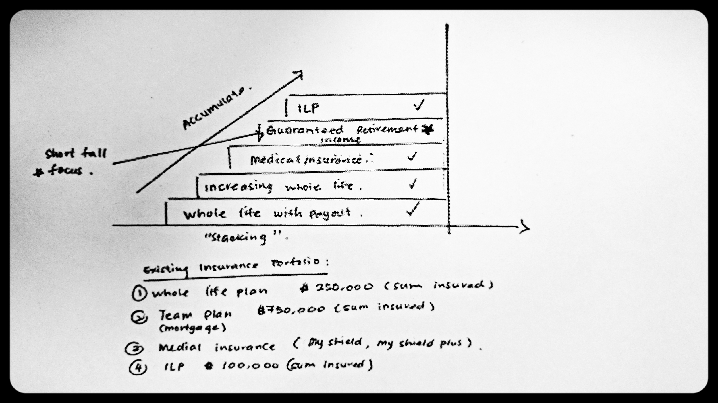
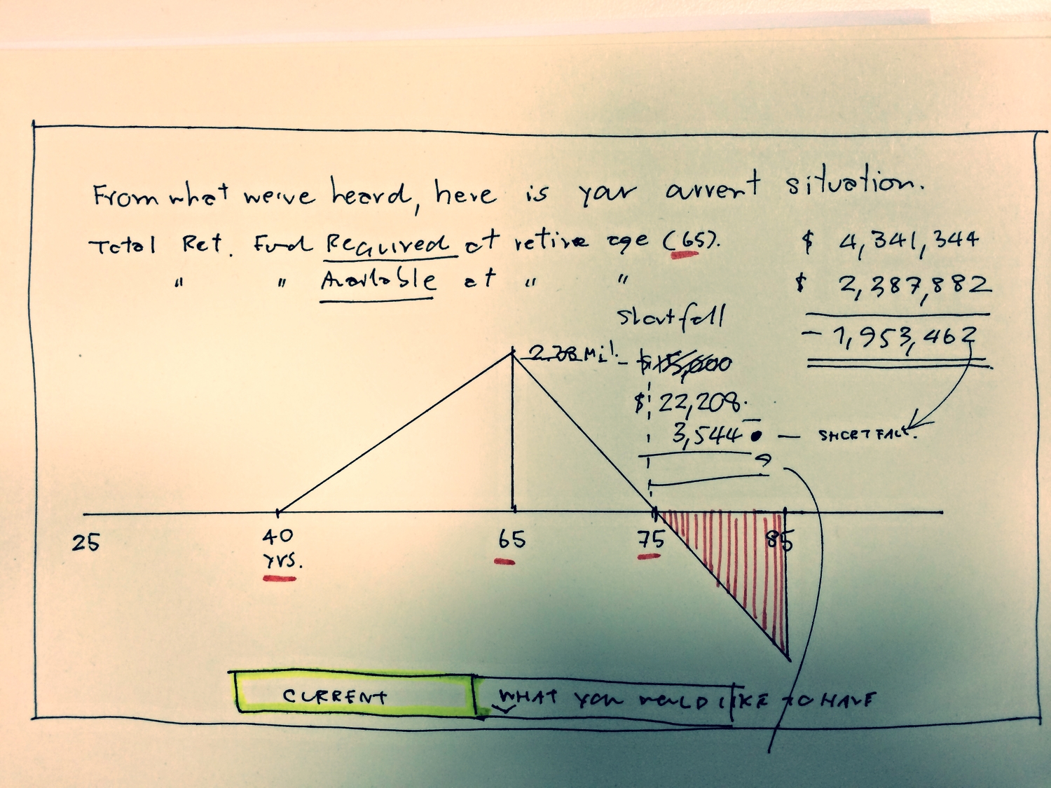
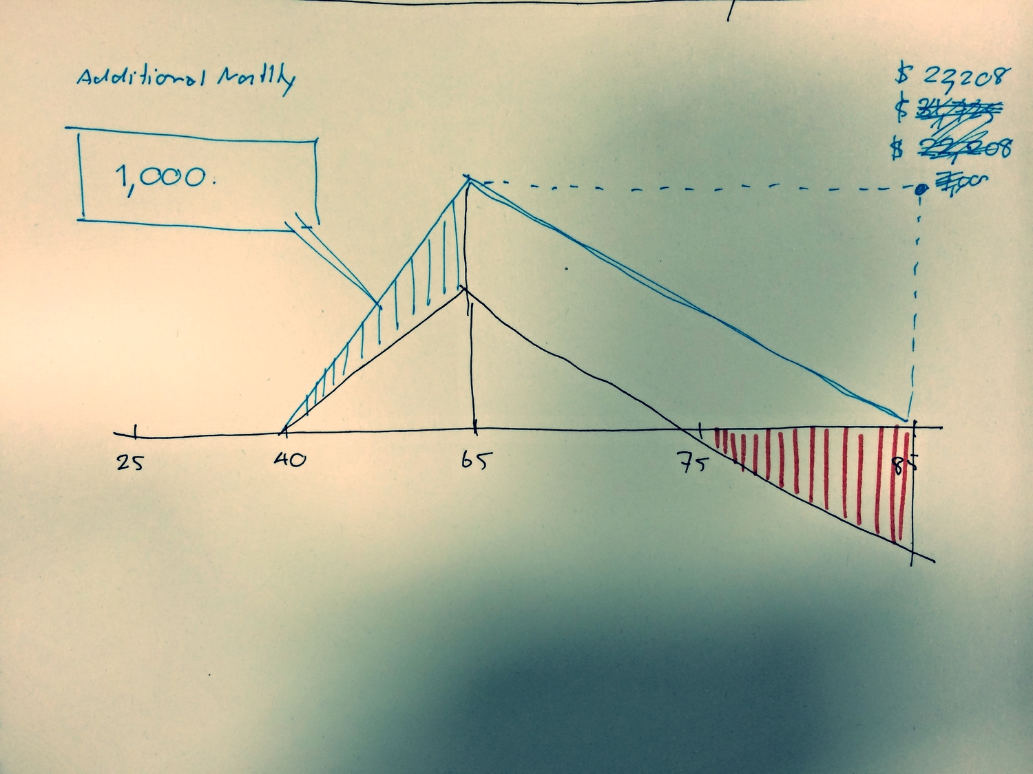
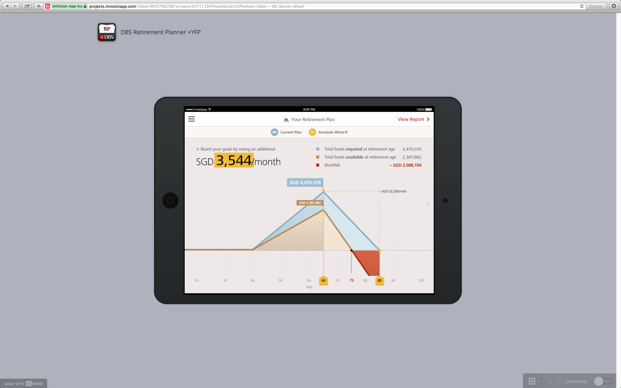
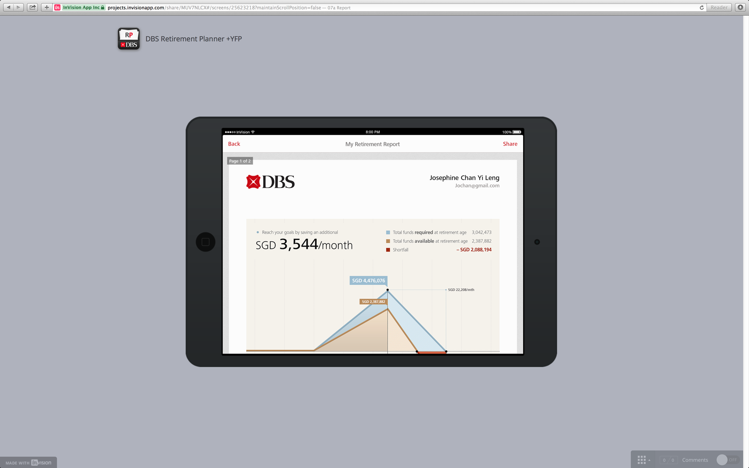
Illustrate the retirement facts, awareness of rising costs of living and retirement income gap.
HOW IT WAS MADE
Frame the problem • Design together • Measure effectiveness
I. FRAME THE PROBLEM
To get what would be outcome and what would be the benefits for customers.


II. DESIGN TOGETHER
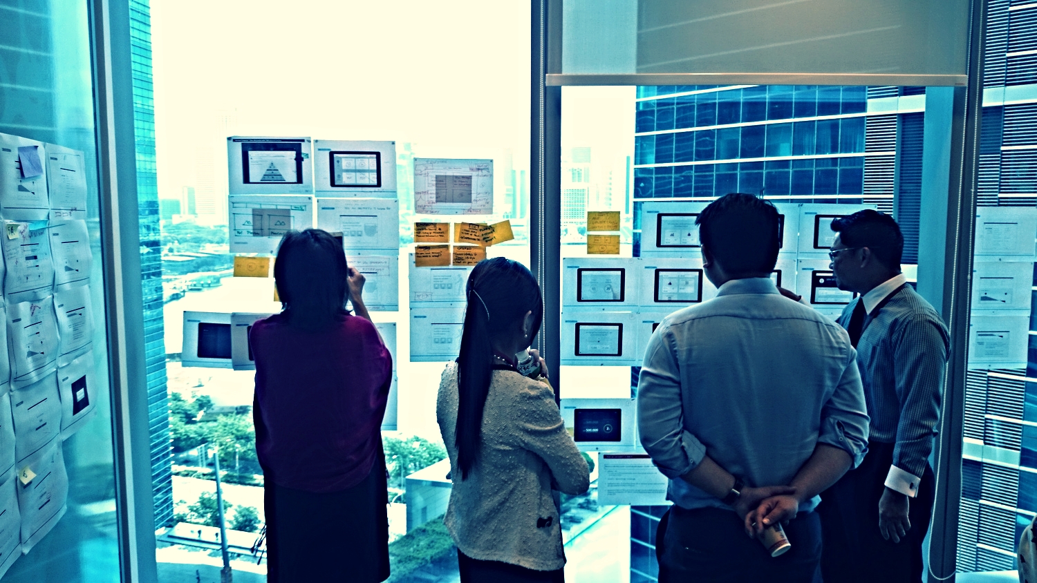
Seeking insights to form possible design solutions; prototyping potential solutions.

One band. One sound.
Collaboration: We don’t believe in one-man-show or one hero, but we believe that a great team work can do an amazing thing. With different skills set and subject matter experts, it helps making a better products for our customers.
Point A. Point B.
Creating key user's journey so that we know where is the starting point and where is the finishing line.
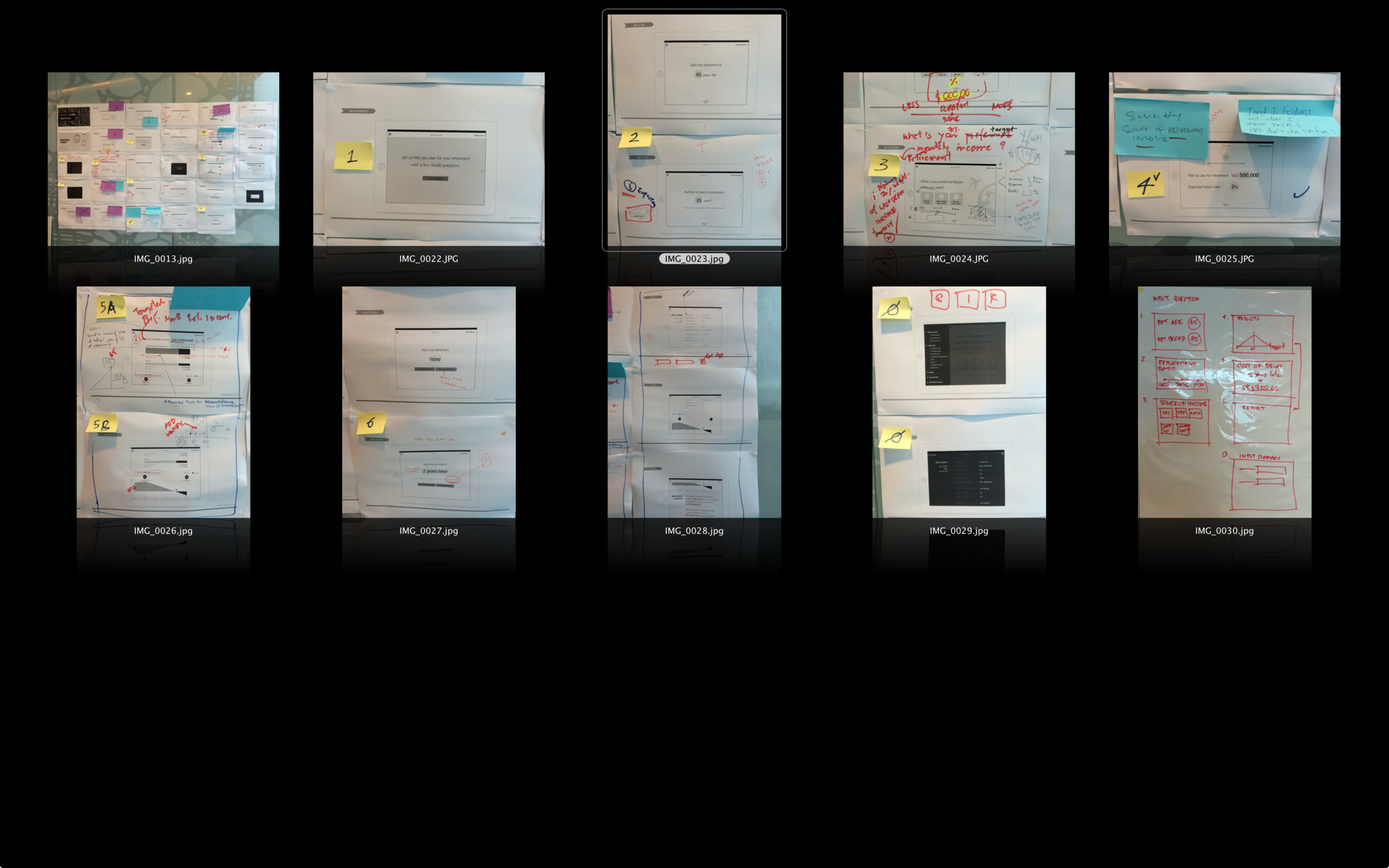
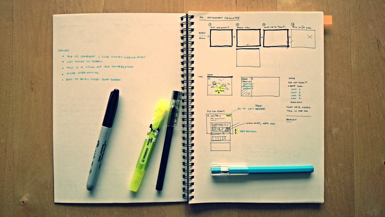
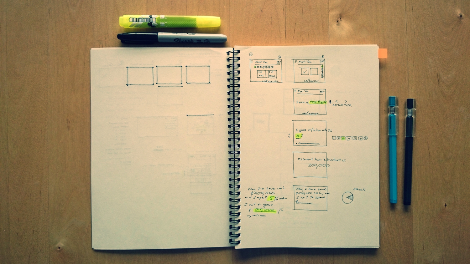
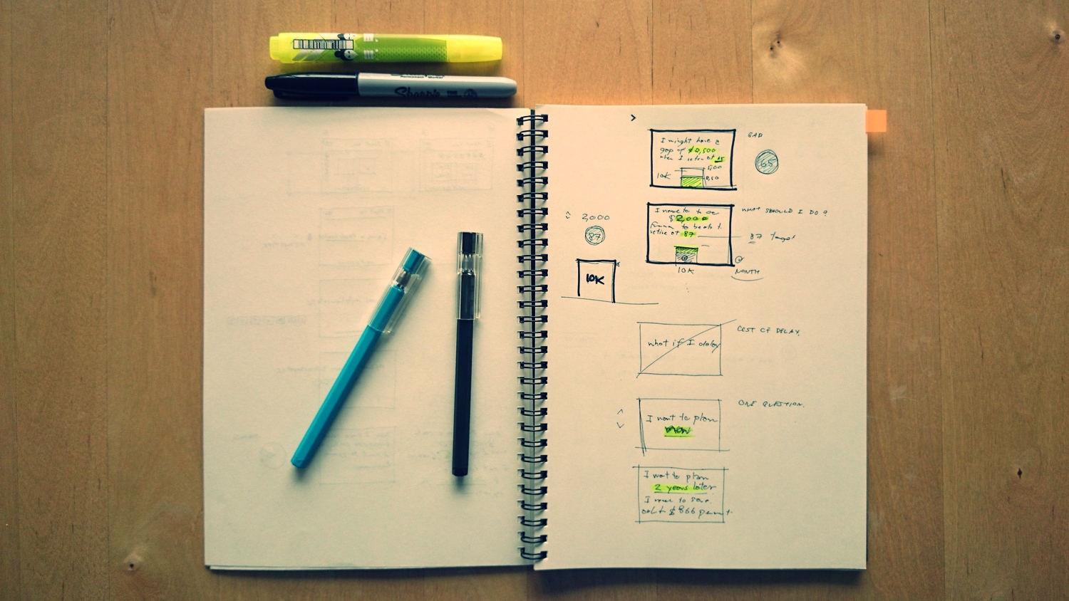
Thousand words. One picture.
Sketching out the ideas is the best way to make every in the team under that we have the same picture.
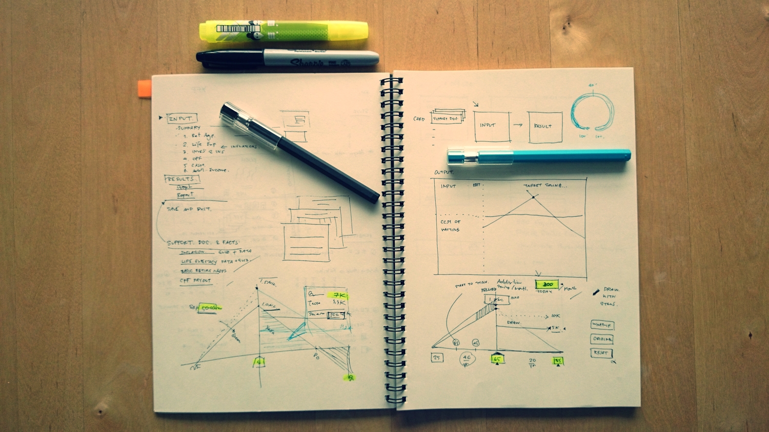
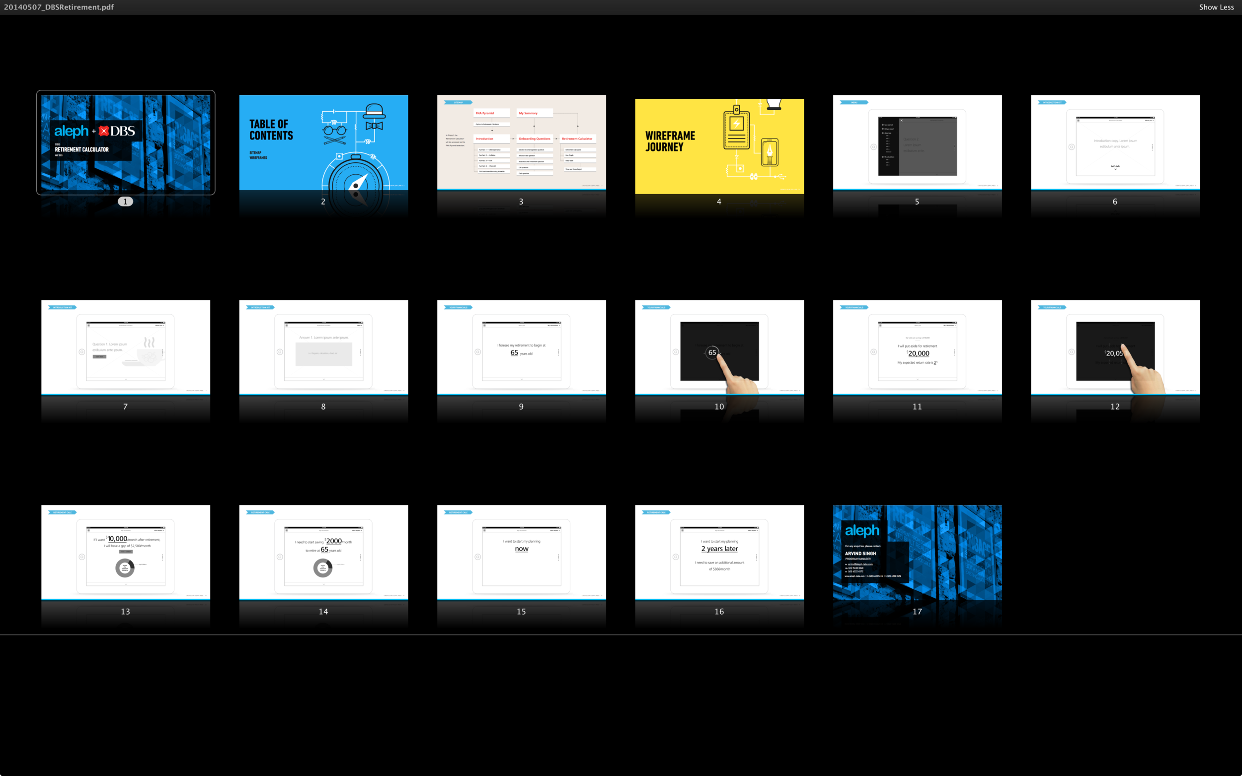
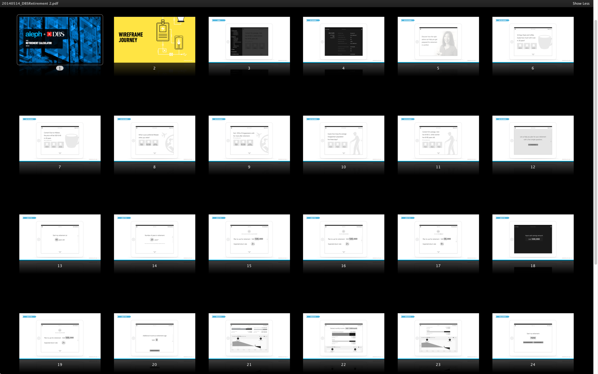
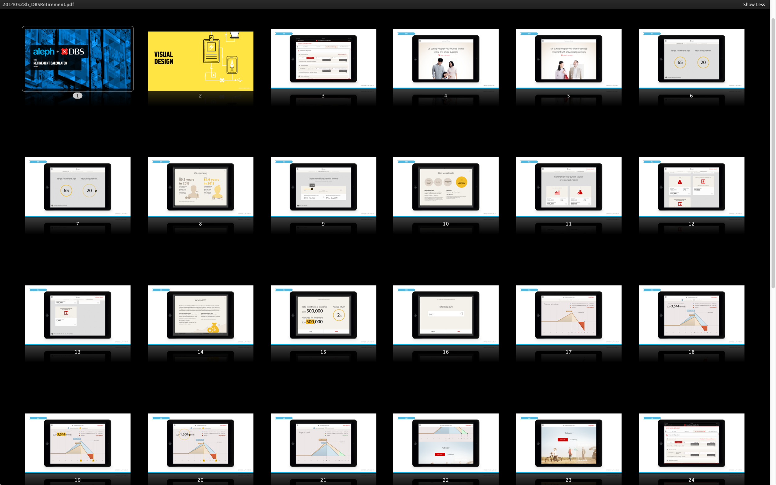
Iterate. Version 1 until Version 42.
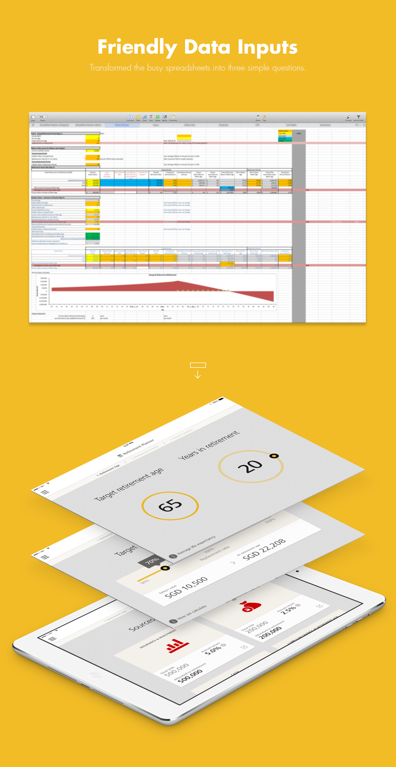
Desiging wireframe and doing visual design exploration until we found the design solutions.

Don’t tell. Show it.
Prototyping helps the whole team see what would be the final product, and have opportunities to fix some features which can’t be seen in PDF or static.
Not pieces. The whole.
Design the system, UI Kits is a modular front-end framework, the enable us to develop fast and scalable web interfaces.

Light weight. Any size. Any color.
Icon fonts are awesome. Bitmap images don’t scale well. They can lose quality when scaled up and waste file size when scaled down. They require http requests for each image, further slowing load times. They’re also difficult to manipulate without reworking the image in an image editor.
Fonts don’t have these problems. They scale well and don’t require http requests for each character. Some reasons why we should to use icon fonts: scale easily, change colour easily, can have transparent knockouts, can use text based css, can be designed on the fly (by making changes on :hover, change opacity, rotate, etc.)
III. MEASURE EFFECTIVENESS
To verify the design solutions, and to iterate for next design solutions.

Will be updated after going live in August 18th.
LAUNCHED ON AUG 18, 2014
The team has pulled the amazing energy to launch this app from start to finish in 12 weeks.
Live Version (2014 Aug)
Not Enough? No worry.
If you have time, I’ve created a few more design journal for you.